On (re)starting a blog
this time it is going to be better (every programmer when rewriting their code from scratch)
The idea to restart the blog was lingering in my brain for quite some time. It was never the right time: sometimes I was not sure I have anything to say, often it was dissatisfaction with the available tools and a fear of the amount of effort this endeavor will require. But sometimes you have to accept that things will not be perfect from the start, and some tinkering will be always required.
Table of contents
But why?
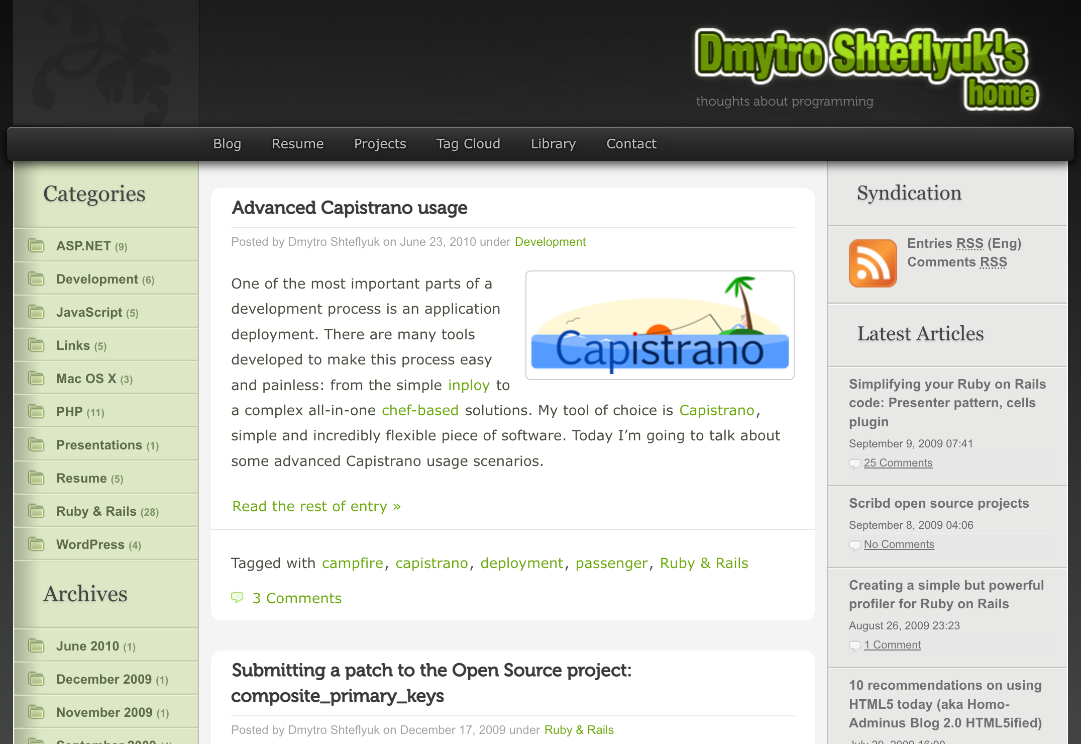
I have had a blog before. I started it back in 2005 when I was young, stubborn, and very opinionated (spoiler alert: not young anymore), and passionately wrote about technologies I was working with, how people around me are all wrong, and occasionally shared some of my thoughts. I have not been shy to call somebody stupid for sharing an article aimed at beginners, or questioning the sanity of an open-source library maintainer when they introduce a bug in their project (yes, I personally never add any bugs to my software, that’s just a waste of time!) The themes of blog posts shifted from PHP to JavaScript to .NET to Ruby to system administration, following my professional career and interests. Looking back at that person that I share the name with, it is very interesting to see how far we have fallen apart, yet still share one of my most cherished traits: curiosity.

I remember how much satisfaction I get when writing a thoughtful piece, showcasing a solution for a tricky problem, or just sharing what’s on my mind. At the same time when I prepare a post, I start second-guessing my knowledge and ideas, search for references and inspiration from people smarter than me, read whatever I could find on the topic, and end up learning a lot and even more things to learn. So, it is decided: the main purpose of this place will be learning, sharing, and exploring matters I am curious about.
Requirements
I have had a love-hate relationship with WordPress for decades. It is an amazing framework, that allows infinite customization and easy extension, and has the largest user base in the world (at least used to). Do you need code highlighting, taxonomy clouds, advanced attributes, calendars, or contact forms? Well, choose from hundreds of plugins and themes, free and paid, well-supported and pretty much unmaintained. I even built a few of them myself.
But I am getting older, and my priorities shifted. I want something that is:
- Easy to write. Preferably, without clicking buttons to create a paragraph, and another button to add a link to it. Ideally, in my text editor.
- Easy to publish. Making a commit to a repository should make magic happen.
- No tracking. I will put this very high on the list, as nothing bothers me more than all those “Accept all cookies” popups. No, I do not accept, please stop bothering me already! This means there will be no comments, at least at the moment — there are GitHub and social media links at the bottom.
- Fast. Fast to load, fast to render, fast to read, fast to build.
Alright, there are also some nice-to-haves I will put forward:
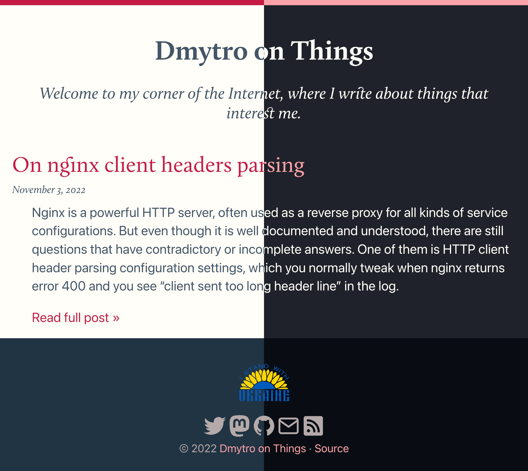
- Pleasant. Yes, this is very subjective, but it should look modern, support a dark/light theme, good typography (well, to my taste).
- Open to tinkering. This is very important. I love touching things, moving pixels here and there, and building tools and automation for no apparent reason.
Choosing a platform
At this point, I am down to either a static site or… Alright, there is no “or”. A static site it is. At first, the list of tools that can generate a static website is breathtaking. Why? Because it is easy to build, everybody and their mother build one. Some are more optimized for documentation presentation, some can be compiled into an e-book. So, let’s exclude something that I definitely do not want.
I have complex relationships with JavaScript. I find the language esoteric enough to keep me interested (like that close friend that keeps surprising you with random and unpredictable behavior even after 20 years), and at the same time fast and powerful enough to provide a foundation for building a huge chunk of modern technology. I’m writing this in Visual Studio Code, lint with prettier, and taking notes in Obsidian — more than enough proof that JavaScript got out of its browser sandbox. On the other hand, the JavaScript world moves very fast: what was the bleeding edge technology today is frowned upon in a year and ancient history in 5. I personally do not have enough stamina to keep up with all those React, Svelte, Webpack, and esbuild quirks, constantly questioning myself: “Dmytro, are you doing it right?”
With JavaScript/React out of the question (a huge chunk!), I’m down to:
- Hugo — one of the most popular generators, blazing fast, well maintained. The downside is that it does not support plugins, and is relatively hard to extend. On the other hand, a lot can be achieved through templates.
- Jekyll — one of the oldest projects, written in Ruby, and powering GitHub Pages. I love Ruby, I work with Ruby every day, this is an easy choice.
- Zola — Rust-based generator, that supports pretty much everything one would want from a generator.
- … and a thousand more. A lot of them have a user base, a thousand(ish) stars on GitHub, and active maintainers, but at this point, I just wanted to start writing.
I tried some of the JavaScript/React engines (Next.js, Gatsby), Jekyll (been using it in GitHub Pages), Zola, and Hugo — and the last one felt just right. And so, Hugo it is: fast, does not get in the way, and there is more than enough information on the Internet to help with any problem I might have.
Design and implementation

I started with high-level ideas:
- No noise. This means the header should not take half of the page (yes, I would like you to know whose site this is, but not before you read what you came here for), sidebars, and various floating panels that follow you as you scroll down, etc.
- Respect user choices. Most modern systems allow users to choose a light or dark theme, and if you’re on a dark one and then open a site with white background — it pops right into your face with all the brightness. Same thing about enforcing dark colors for people who configured light theme (many people find the text in a dark mode having lower contrast and strain the eyes more, for example this thread).
- Pleasant. Here it is again, a subjective idea. But then, it is quite easy to measure,— I’m building my website, so I should like it. Duh.
Since I have very little understanding of how Hugo themes are designed, I started with a theme that looks pretty good: Paper. There is a problem though: it comes with Tailwind CSS, which is an interesting way to work with web design, but I find it too heavy and too vague (for me, CSS is a way to abstract implementation behind the semantic structure, not replace the semantic structure with inline implementation). So pretty much from the start I have deleted the styles and started from an empty CSS file.
I admit, this went a little bit too far, and to illustrate, here are some of the resources I used to get the design:
- You don’t need Bootstrap. An amazing resource for those who find it awkward to start with a CSS framework by default. Apparently, modern CSS makes everything much simpler.
- An Interactive Guide to Flexbox. If you still think that you need some kind of grid framework to get the layout right — go through this tutorial. The advances in CSS are astonishing.
- Creating a website theme switcher with CSS only. To be honest, I very rarely touch front-end technologies. This article got me up to speed with the idea of CSS variables to manage website color schemes, and the initial implementation of a button to switch the theme (which I abandoned in favor of OS preferences).
- A Complete Guide to Dark Mode on the Web. This article dives into different options to implement dark mode design, along with some issues that you might not have thought of (images contrast, shadows, font contrast).
- Dark mode and variable fonts. An amazing exploration of how fonts are perceived on light and dark screens.
- Responsive And Fluid Typography With vh And vw Units. Continuing the fonts discussion, this article goes into fluid typography implementation. This ensures that the text on the website looks fine whether you open it on a desktop or mobile device.
- To Ligature or Not to Ligature. I am in love with discretionary ligatures. Scroll up to the top of the page, and note the little ark between “s” and “t”. Remember what I said about a lightweight and fast website? Well, that little arc costs 120 KB of traffic, and I will trade it any day over the JavaScript bundle. The font family is Calluna. Originally I wanted a custom font for the text as well but decided to stick with a normal sans serif.
- OKLCH in CSS: why we moved from RGB and HSL. This is an eye-opener for those who are as ignorant as me about color theory. I do not use OKLCH in this blog due to browser support (I don’t want any of the asset pipelines or polyfills), but I tried to apply the theory when choosing colors. This color picker is amazing.
- Coloring SVGs in CSS Background Images. This is an interesting trick I used in the footer to show links to social media sites. Single SVG file that renders differently in light and dark themes.
There is a lot more, of course, but this is already getting very long. The theme used here is completely open source, feel free to check it out. I also intentionally disabled any minification or obfuscation for the resources, so you should be able to just view the source right in the browser.
Hosting
There are many options to host your website, some are free, and most are very cheap. I went with Netlify primarily just to try it out. It integrates with most static site generators seamlessly, a few clicks away from the Git repository to a live website. I have started with Web UI, and then created a configuration file to ensure that the Hugo version matches between my machine and Netlify deployment.
Another amazing feature is branch deployments. If you create a merge request in GitHub, Netlify can deploy a preview website to test the changes without affecting the main one. I used this feature a few times to test some of the tricky changes.
Another notable feature of Netlify is the ability to set up redirects based on request conditions. For example, if I want people coming from Russia, a country that invaded my homeland and terrorizes civilians (including my family and friends) for many months, to proceed directly to a dedicated landing page, I can do this with a few lines in the configuration file.
Closing remarks
And this concludes the story. If you don’t yet have a blog — go build one, I promise you will learn something cool. If you have one — tell your story, maybe it will inspire somebody else to share their thoughts and expertise with the world. And if you have any feedback for me — please reach out via one of the links below.